CLICK IMAGE TO PLAY
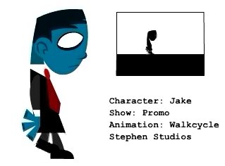
Hey everybody!! He'res a walkcycle ive been working on for jake. The box in the top right is what the animation is gonna be. So in my promo, its basically that but 320 x 240. Let me know what you think, and any suggestions would be great!
Steve
- Unknown had this to say:
hi Stephen...I think the character and the style chosed is really rocking!!
but was wondering if a leeeeeetle more movement for the body is required..like a slight tilt and back?? like the way u treated the head maybe...???
of course i am not seeing the animation in it's entire context
cheers- Stephen M. Levinson had this to say:
Thanks for your suggestions. I'll def work on it, and try some things out. I just know theres something off with this walkcycle and the suggestions are great!
Steve
www.stephenstudios.com- unbemerkt had this to say:
nice, stephen.
i would try to make it a little more alive. how do you walk? how others do?
take a good look and try to transfer it to your walkcycle- Jeremy had this to say:
Hey Stephen, thanks for your comments on my work. Glad to hear you liked it. I think the character you have here is pretty cool and walk is coming along well. For the style you've chosen to work with, I wouldn't do too much extra to his body. Maybe add in a slight squash and stretch on the contact and then as he rises up. The big thing to watch out for is the foot spacing and arcs. If you need to see a visual representation, take the heel and plot the arcs on a layer above the animation. I don't know if you rough everything out with the brush tool first but it really helps to keep everything loose. Watch out for the head rotation and make sure the pivot point is moved to the base of the neck. Good luck and keep animating!
- Jeaux Janovsky had this to say:
hey steve,
i think his walkstyle is charming and since he is very designy and flat, it goes hand in hand with one another.
-jx


